Friday, April 1, 2016

Bias Score Analysis

Just a little stuff on the Bias Detector. Overview based on individual users (box & whisker dots act as filter):


And by domain (compare multiple domains by searching):


Wednesday, March 16, 2016

Comparing Clinton & Bernie Fundraising in the Northwest

I got curious about trends in donations to presidential candidates, and especially Bernie Sanders' claim that his average donation is only $27, so I decided to crack open the FEC numbers.  The national files you can get from the FEC are huge, so I decided to focus on Washington and Oregon.

First, the basics. The records run from April 1, 2015 to February 1, 2016 and include donations from individuals.  PAC and political party donations are not included.  FULL DISCLOSURE: I donated a whopping $3 to Sanders in February. Unfortunately, I'm outside the time range so I don't get to drag his average down further.

Washington


The first observation is that Bernie out-fundraises Clinton because he has triple the donors giving one-third as much per contribution.

The maximum donation allowed is $2700, so I split the donations into small ($100 or less) and maximum ($2700) categories to see how the two candidates do at the ends of the spectrum:


Max donations account for more than half of Clinton's total contributions, while for Sanders they account for about 2.5%.

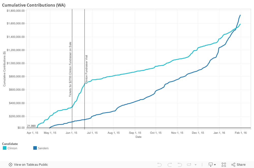
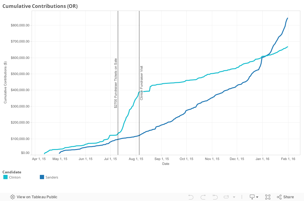
Here is each candidate's cumulative donations over time:


As you can see, Sanders overtook Clinton on January 25 after trailing since the beginning of the season.  Clinton's lead was sustained by a big surge in June 2015.  I checked to see what was going on on June 20, the end of the increase, and found that Clinton hosted a $2700/ticket fundraiser called "Conversation with Hillary" on that date at the Madison Park home of a donor. Tickets went on sale in early June.  Since money is speech, I wonder if Clinton was able to get a word in edgewise.

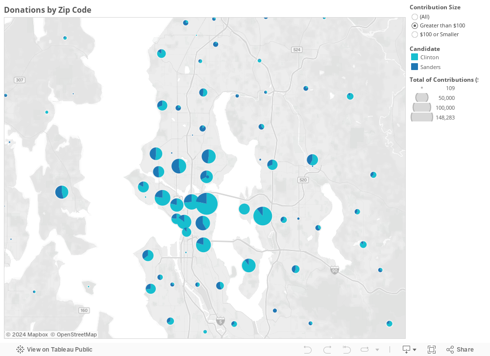
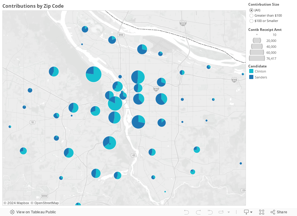
Lastly, here is a map of contributions by zip code.  The pie chart on each zip splits the donations into Clinton and Sanders slices.  Use the tool to the right of the map to filter the contributions into >$100 and <$100 categories:


The difference between the two candidates' shares of small donations and large donations is striking.  Clinton receives a majority of large donations in most zip codes, while Bernie takes an overwhelming majority of small donations in almost every zip code.  

Oregon


The numbers from Oregon tell a fairly similar story.  The summary:


As in Washington, Sanders has more than triple the number of contributors and less than 1/3 the average donation size.  Here's Small vs. Large Contributions:


Again, Clinton draws more than half of her money from maximum contributors; for Sanders, it's 2%.

The cumulative contributions tell the same story, down to the Clinton surge ahead of an expensive fundraiser visit.  Tickets for the August 5, 2015 event went on sale July 10. 


The map tells a similar story to Washington, with an even greater polarization between neighborhoods, and small and large donations.  In Portland's Southwest Hills, for instance, Clinton takes 89% of contributions over $100, while Sanders takes 82% of contributions under $100. In my own neighborhood, NE Portland, 98.5% of small donations go to Bernie:


Looking at the map, I noticed that in the Portland area, the Willamette River seems to be a dividing line between Clinton and Sanders fundraising majorities. Sure enough:


There are a lot of conclusions you could draw from this stuff, but to me the basic takeaway is that, at least in the NW, a larger group of individuals of more modest means see Sanders as the candidate representing their interests, while individuals with thousands of dollars of expendable income see Clinton as representing theirs.

Saturday, October 31, 2015

More Team Pursuit Intrigue

Oh yeah baby, it's team pursuit season!  The Cali World Cup is this weekend, which means all sorts of juicy Tissot timing .csv files are hitting the web as we speak.  It's been a while since the days when I pored over my own (hell of slow) pursuit splits, and (for the moment) I'm living vicariously through way faster people.

The US Women's TP in full flight.  Pic from Guy Swarbrick

The TP is a pretty rad mix of anaerobic/aerobic demands, technique, and pacing strategy.  I might crack open the MAOD simulator whirlygig soon to look at the physiological side soon, but since I haven't quite hacked the US National Team's power files yet, I figured I'd look at something simple regarding pacing, especially since the women's race is a good example of how different race situations call for different strategies.

One of the cool elements of TP (and team time trial, which I got to race some of in college) is that the team has to decide how to manage racing with riders of different strengths / aero profiles.  Do stronger riders pull longer at the same speed, faster for the same duration, or somewhere in between? How would having a 6'3" rider drafting behind a 5'7" rider affect length/intensity of pulls?  The conventional wisdom is that constant speed is better than equal-length pulls, since the added stress of accelerating/decelerating as different riders hit the front usually outweighs any benefit.

So is that how it works at the highest level? I got the lap splits from the men's and women's qualifying, first round, and finals races and plotted the standard deviation of lap times vs the team's final race time.  On the graphs, closer to zero on the x-axis means more consistent pacing, and closer to zero on the y-axis means a faster time.  First, the men:


There aren't a ton of data points, but generally, faster teams are also more consistent in their pacing.  On average, for every additional second of lap inconsistency, you might expect a team to go 10 seconds slower (insert large grain of salt).  The limit of just looking at split times is that obviously, all the teams don't start with the same horsepower, resources, training time together, etc.  Given how specialized an event like the TP is, countries that put more resources into training a dialed TP team likely see benefits in both increased strength and technique. (Profound, I know.)

LLLLLLLLADIES!

The positive correlation between lap time consistency and final time was stronger in the women's races--in the neighborhood of 18-21 seconds faster overall per second of lap consistency.

One way to look at the data points is to view points below the regression line as having more horsepower and less consistent pacing, while points above the line have better pacing but less horsepower.  The most interesting example is in the women's final, where Canada beat the US 5:20.1 to 5:25.8.  Despite being in the gold medal ride, the US women had the most lap variation of all eight finals runs.  Here's what the lap splits between the US and Canada looked like:


The increase in the blue line in the last few laps is the US team losing some steam.  One reason they may have slowed down is that they had to burn a big match in the first round (where they rode a 4:21.5) just to make it to the gold medal ride. Another may have to do with the structure of the competition affecting their strategy.  If a team is trying to do the fastest run they can, a consistent pacing strategy is ideal.  But the strategy changes once you're in the gold medal ride where the worst you can get is 2nd place, and you're facing an opponent that has been consistently stronger than you.  In that case, the best option may be to try and match them, even if it means risking blowing up in the final kilometer.  It looks like that's what happened to the US women's team.  But nothing ventured, nothing gained! And they still wound up with a silver medal.

A cool problem would be looking at TP power files and coming up with a way to model the actual cost of inconsistency. But that will have to wait until I want to do something other than some rookie ax+b nonsense.